PINQ Privacy Demo
Editor’s Note: Tony Gibbon is developing a datatrust demo as an independent contractor for Shan Gao Ma, a consulting company started by Alex Selkirk, President of the Board of the Common Data Project. Tony’s work, like Grant's, could have interesting implications for CDP’s mission, as it would use technologies that could enable more disclosure of personal data for public re-use. We're happy to have him guest blogging about the demo here.
Back in August, Alex wrote about the PINQ privacy technology and noted that we would be trying to figure out what role it could play in the datatrust. The goal was to build a demo of PINQ in action and get a better understanding of PINQ and its challenges and quirks in the process. We settled on a quick-and-dirty interactive demo to try to demonstrate the answers to the following.What does PINQ bring to the table?Before we look at the benefits of PINQ, let’s first take a look at the shortcomings of one of the ways data is often released with an example taken from the CDC website.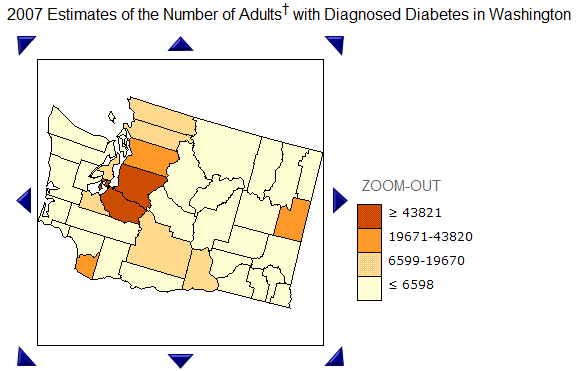 This probably isn’t the best example of a compelling dataset, but it is a good example of the lack of flexibility of many datasets that are available—namely that the data is pre-bucketed and there is a limit to how far you are able to drill down on the data.On one hand, the limitation makes sense: If the CDC allowed you (or your prospective insurance company) to view disease information at street level, the potential consequences are quite frightening. On the other hand, they are also potentially limiting the value of the data. For example, each county is not necessarily homogenous. Depending on the dataset, a researcher may legitimately wish to drill down without wanting to invade anyone’s privacy—for example to compare urban vs. suburban incidence.This is where PINQ shines—it works in both these cases. PINQ allows you to execute an arbitrary aggregate query (meaning I can ask how many people are wearing pink, but I can’t ask PINQ to list the names of people wearing pink) while still protecting privacy.Let’s turn to the demo. (Note: the data points in the demo were generated randomly and do not actually indicate people or residences, much less anything about their health.) The quickest, most visual arbitrary query we came up with is drawing a rectangle on a map and counting each data point that falls inside, so we placed hundreds of “sick” people on a map to let users count them. (Keep in mind that the arbitrariness of a PINQ query need not be limited to location on a map. It could be numerical like age, textual like name, include multiple fields etc.)Now let’s attempt to answer the researcher’s question. Is there a higher incidence of this mysterious disease in urban or suburban areas? For the sake of simplicity, we’ll pretend he’s particularly interested in two similarly populated, conveniently rectangular areas: one in Seattle and the other in a nearby suburb as shown below:
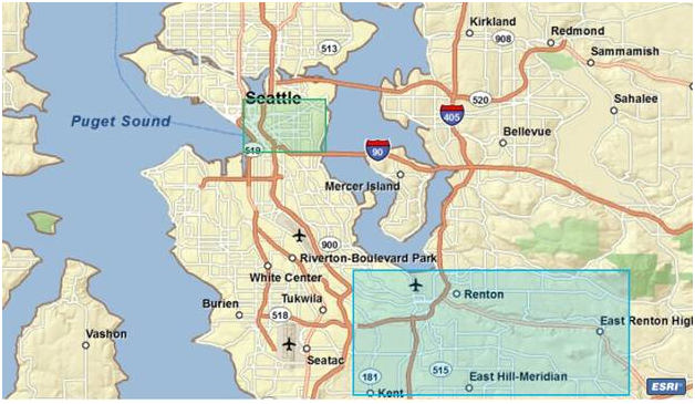 An arbitrary query such as this one is clearly not possible with data that is pre-bucketed such as the diabetes by county. Let’s take a look at what PINQ spits out.
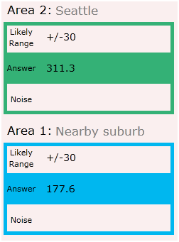 We get an “answer” and a likely range. (The likely range is actually an input to the query, but that’s a topic for another post.) So what does this mean? Are there really 311.3 people in Seattle with the mysterious disease? Why are there partial people?PINQ adds a random amount of noise to each answer, which prevents us from being able to measure the impact of a single record in the dataset. The PINQ answer indicates that about 311 people (plus or minus noise) in Seattle have the disease. The noise, though randomly generated, is likely to fall within a particular range, in this case 30. So the actual number is likely to be within 30 of 311, while the actual number of those in the nearby suburb with the disease is likely to be within 30 of 177.Given these numbers (and ignoring the oversimplification and silliness of his question), the researcher could conclude that the incidence in the urban area is higher than the suburban area. As a bonus, since this is a demo and no one’s privacy is at stake, we can look at the actual data and real numbers:
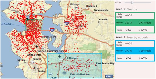 The answers from PINQ were in fact pretty close to the real answer. We got a little unlucky with the Seattle answer as the actual random noise for that query was slightly greater than the likely range, but our conclusion was the same as if we had been given the real data.
But what about the evil insurance company/ employer/ neighbor?
By now, you’re hopefully starting to see potential value of allowing people to execute arbitrary queries rather than relying on pre-bucketed data, but what about the potential harm? Let’s imagine there’s a high correlation between having this disease and having high medical costs. While you might want your data included in this dataset so it could be studied by someone researching a cure, you probably don’t want it used to discriminate against you.To examine this further, let’s zoom in and ask about the disease at my house. PINQ only allows questions with aggregate answers, so instead of asking “does Tony have the disease?” we’ll ask, “how many people at Tony’s house have the disease?”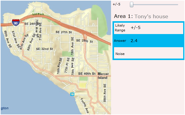 You’ll notice, unlike the CDC map, PINQ doesn’t try to stop me from asking this potentially harmful, privacy-infringing question. (I don’t actually live there.) PINQ doesn’t care if the actual answer is big or small, or if I ask about a large or small area, it just adds enough noise to ensure the presence or absence of a single record (in this case person) doesn’t have an effect on your answers.PINQ’s answer was “about 2.4, with likely noise within +/- 5” (I dialed down the likely noise to +/-5 for this example). As with all PINQ answers, we have to interpret this answer in the context of my initial question: “Does Tony have the disease?” Since the noise added is likely to be within 5 and -5, the real answer is likely to be between 0 and 7, inclusive, and we can’t draw any strong conclusions about my health because the noise overwhelms the real answer.Another way of looking at this is that we get similarly inconclusive answers when we try to attack the privacy of both the infected and the healthy. Below I’ve made the diseased areas visible on the map and we can compare the results of querying me and my neighbor, only one of whom is infected:
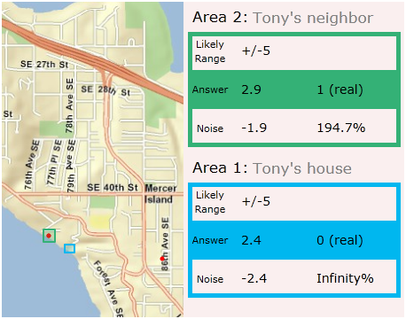 Keep in mind that my address may not be in the dataset because I’m healthy or because I chose not to submit my information. In either case, the noise causes the answer at my house to be indistinguishable from the answer at my neighbor’s address, and our decisions to be included or excluded from the dataset do not affect our privacy. Of equal importance from the first example, the addition of this privacy preserving noise does not preclude the extraction of potentially useful answers from the dataset.You can play with the demo here (requires Silverlight).